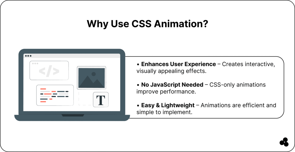
Want your website to move — literally? CSS animation lets you transform static web pages into dynamic, interactive experiences that captivate visitors.
But if you’ve ever tried adding motion with JavaScript, you know it can get complex, not to mention performance-heavy.
That’s where CSS animation shines. It’s lightweight, powerful, and fully supported across modern browsers. Whether you’re creating subtle hover effects or full-scale motion design, you can do it all with CSS.
In this guide, you’ll learn everything about CSS animations from syntax and keyframes to browser compatibility, best practices, and real examples.
By the end, you’ll be able to design smooth, professional animations that bring your UI to life — no JavaScript required.
What is CSS Animation?
CSS animation allows you to animate HTML elements directly in your stylesheet — no JavaScript or plugins needed. Using the @keyframes rule, you define states of a component and tell it how to move or change over time.
Here’s a simple example:
@keyframes fadeIn {
0% { opacity: 0; }
100% { opacity: 1; }
}
.element {
animation: fadeIn 2s ease-in-out;
}
This will fade in an element smoothly over two seconds.
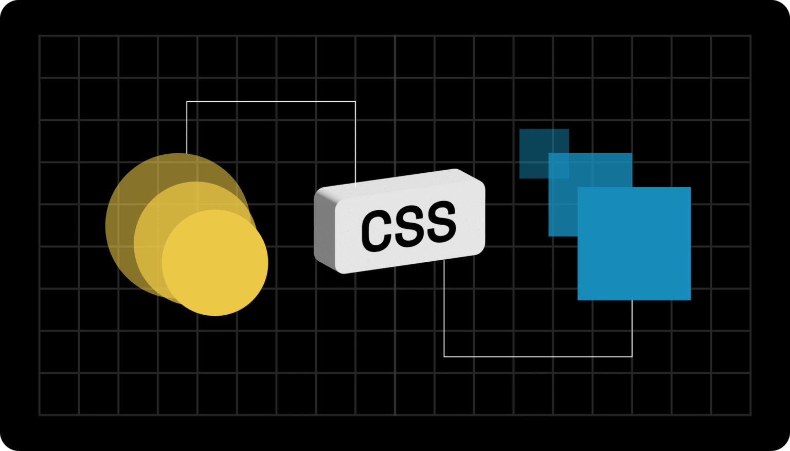
💬 FAQ: What is the difference between CSS transitions and animations?
CSS transitions handle simple, state-based changes (like hover effects), while animations give you more control — they can loop, include multiple steps, and combine several effects.
👉 Learn more about transitions vs. animations
Understanding CSS Animation Syntax
The core of CSS animation lies in the animation property. It’s a shorthand for several sub-properties, including duration, timing, delay, and more.
CSS Animation Syntax
animation: name duration timing-function delay iteration-count direction fill-mode play-state;
CSS Animation Properties Table
| Property | Description |
|---|---|
@keyframes | Defines the animation sequence |
animation | Shorthand for all animation properties |
animation-delay | Sets when the animation starts |
animation-duration | Defines how long the animation runs |
animation-direction | Controls forward/reverse cycles |
animation-fill-mode | Defines styles before/after execution |
animation-iteration-count | How many times does the animation repeat |
animation-name | The keyframes’ name is applied |
animation-timing-function | Controls speed curve (ease, linear, etc.) |
💬 FAQ: What is the default value for animation-duration?
If not set, the duration defaults to 0s, meaning the animation won’t play at all — a common mistake beginners make.
How to Define Keyframes in CSS
Keyframes are the heart of every CSS animation. They define how your element behaves at different stages of the animation timeline.
Example:
@keyframes spin {
  0% { transform: rotate(0deg); }
  100% { transform: rotate(360deg); }
}

.spinner {
  animation: spin 1s linear infinite;
}
This continuously rotates an element, perfect for loaders or icons.
💬 FAQ: What are vendor prefixes like @-webkit-keyframes and @-moz-keyframes?
They’re used for browser compatibility in older versions of Safari and Firefox. You can safely include them for maximum reach:
@-webkit-keyframes spin { ... }
@-moz-keyframes spin { ... }
Browser Support and Compatibility
While modern browsers support CSS animation well, older ones may require prefixes or have limitations.
| Browser | Version Supported | Notes |
|---|
| Chrome | 43.0+ | Fully supported |
| Firefox | 16.0+ | Supported (-moz- prefix optional) |
| Safari | 9.0+ | Supported (-webkit- prefix for older) |
| Edge | 12.0+ | Fully supported |
| IE | 10.0 | Limited, needs -ms- prefix |
| Opera | 30.0+ | Fully supported |
| iOS Safari | 9.0+ | Supported |
| Android Browser | 4.4+ | Supported |
| Opera Mini | ❌ | Not supported |
💡 Tip: Always test your animations using tools like Can I Use or CSS vendor prefix generators.
CSS Animation Types and Use Cases
CSS animations come in many styles. Each one serves a different UX or design purpose.
| Type | Description | Use Case |
|---|---|---|
| Fade In/Out | Adjusts opacity from 0 → 1 or 1 → 0 | Smooth transitions, modals |
| Bounce | Moves elements up and down repeatedly | Buttons, alerts, entrances |
| Flip | Rotates elements in 3D | Cards, galleries |
| Slide In/Out | Shifts elements into or out of view | Menus, banners |
| Pulse | Expands and contracts elements rhythmically | Notifications, CTAs |
| Color Change | Animates colors | Hover effects |
| Parallax | Creates layered movement | Landing pages, storytelling |
💬 FAQ: What are micro animations?
Micro animations are subtle motion effects (such as a button hover or an input field shake). They improve user experience without distracting the user.
👉 Try building one easily with our CSS Animation Generator.
Multiple Animation Properties Example
You can stack multiple animations in one declaration:
animation: fadeIn 2s ease-in-out, slideUp 1.5s ease 0.5s forwards;
💡 Tip: Always define separate @keyframes for each animation to avoid confusion.
Controlling Timing and Speed Curves
Timing functions let you control how your animation accelerates or slows down.
| Timing Function | Description |
|---|---|
linear | Constant speed |
ease | Starts slow, speeds up, slows down |
ease-in | Starts slow, speeds up |
ease-out | Starts fast, slows down |
ease-in-out | Smooth both ends |
cubic-bezier() | Custom timing curve |
You can experiment with online tools, such as animation-timing function generators, to get the perfect motion curve.
💬 FAQ: How can I make CSS animations smoother?
Use transform instead of top or leftKeep durations consistent and avoid triggering layout recalculations.
CSS Animation Best Practices
Creating animations that look great and perform well is an art. Follow these best practices to keep your designs smooth and accessible:
Performance Tips
- Use
transformandopacityfor smoother GPU rendering. - Avoid animating layout properties like
widthormargin. - Combine animations into fewer keyframes to reduce reflows.
Accessibility Tips
- Respect user preferences:
@media (prefers-reduced-motion: reduce) { * { animation: none !important; } } - Ensure animations enhance meaning — not just decoration.
💬 FAQ: What is the ideal duration for a CSS animation?
For most UI animations, 200–500ms feels natural. Micro animations can be shorter; significant transitions can last up to 1 second.
Tools and Resources for CSS Animations
Level up your workflow with these helpful resources:
- CSS Animation Generator – Instantly create animations without coding.
- Udemy CSS Animation Courses – Master advanced techniques and practical examples.
- Guide to CSS Transform Properties – Learn how transforms work with animations.
- REM vs. PX in CSS – Enhance Your Responsive Animation Design.
- Pros and Cons of Tailwind CSS – Understand how Tailwind handles animations efficiently.
- Convert SVG Files to React – Animate SVGs dynamically in your React projects.
👉 Want to understand why SVGs outperform other formats? Check out our post on The Benefits of Using SVG.
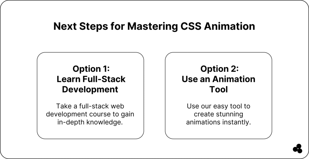
Start Animating with CSS Today
You now know how to create CSS animations — from syntax and keyframes to types, timing functions, and performance tips. By applying these principles, you’ll make your interfaces feel smoother, more intuitive, and alive.
If you want to skip the trial and error, try using the Microapp CSS Animation Generator to build animations in seconds and see your code in action.