You’ve likely used bar charts or histograms at work, school, or while analyzing data, but have you ever stopped to wonder if you’re using the right one?
Choosing between them can be confusing since both look similar, yet they tell very different stories about your data.
We’ve been there too, trying to visualize sales, survey results, or performance reports, only to realize that using the wrong chart can distort the message.
In this guide, we’ll break down histograms vs bar charts, when to use each, their advantages and limitations, and how you can create them using tools like the Microapp Histogram Maker.
Let’s clear up the confusion once and for all.
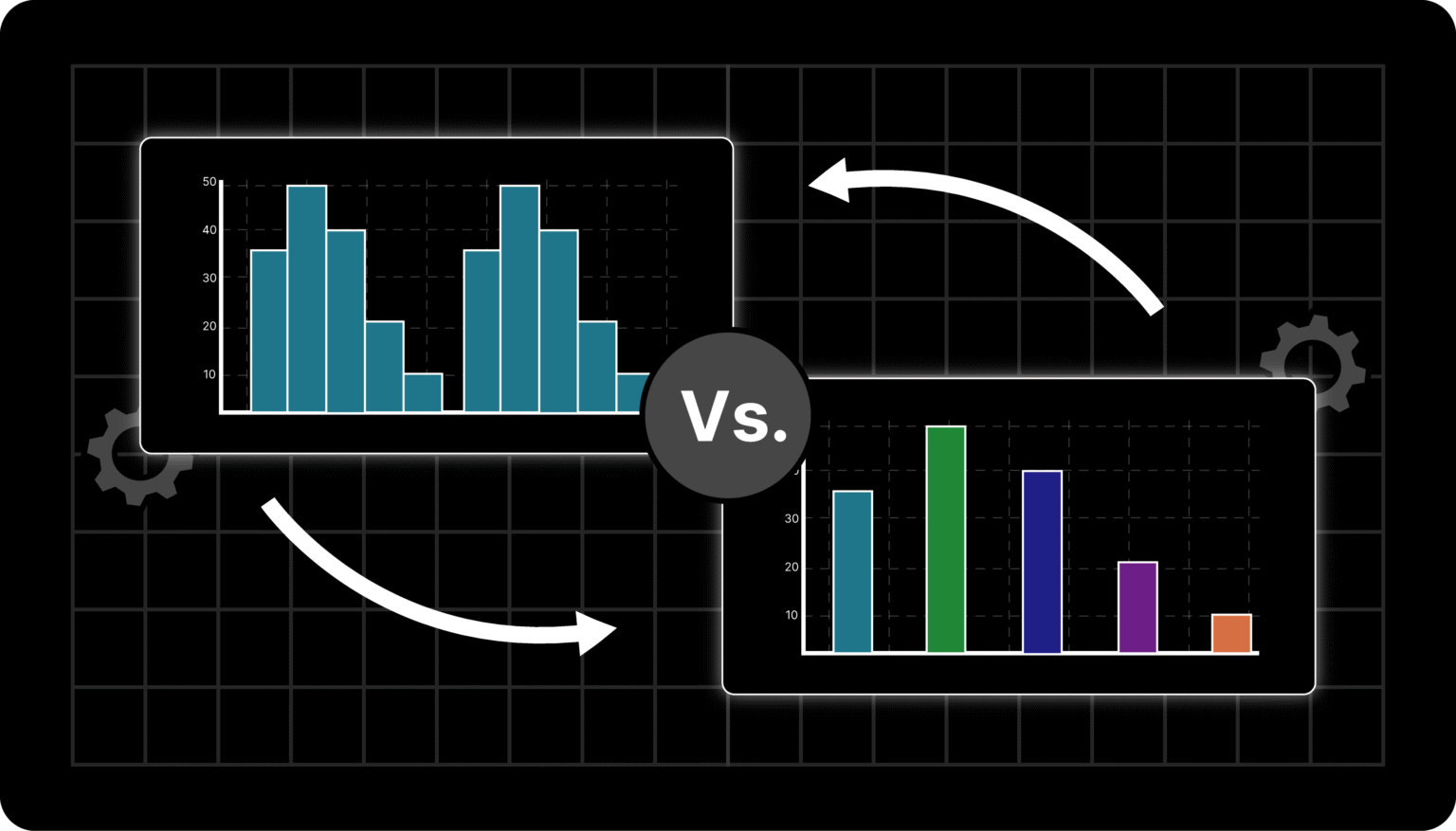
Histograms vs Bar Charts: What Are They?
At Microapp, we’ve used both charts for different data stories. Let’s quickly recap what each does best.
What Is a Bar Chart (or Bar Graph)?
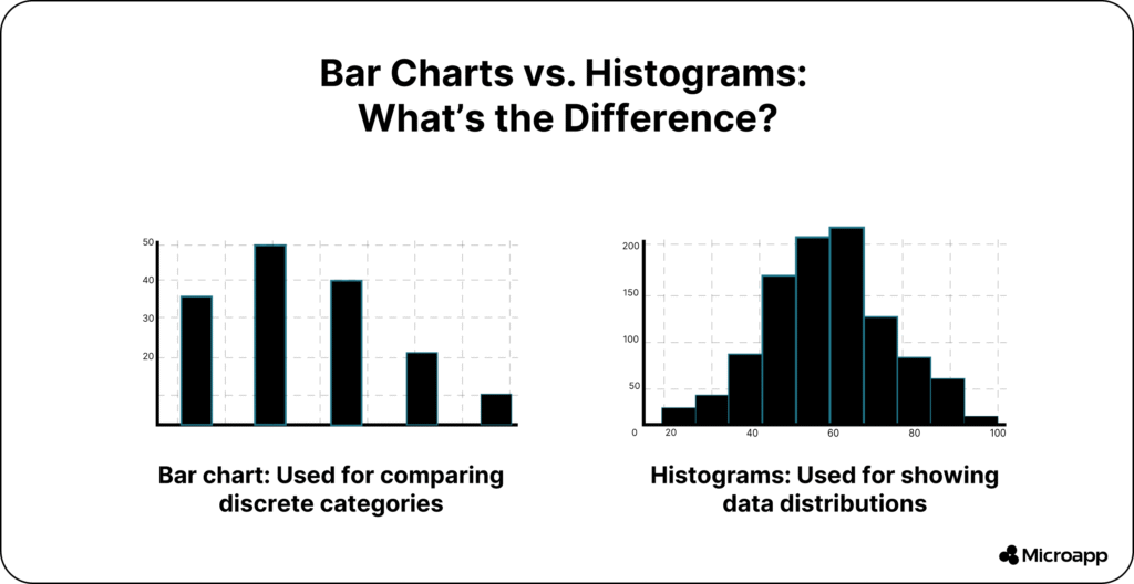
A bar chart (also known as a bar graph) displays discrete or categorical data. It’s ideal when you want to compare different categories—like sales by month, website traffic by source, or students by grade.
Each bar stands separately, emphasizing that the categories are independent. You can use vertical or horizontal bars depending on your preference.
💡 Tip: Always keep your bars the same width for visual clarity.
Use bar charts when you:
- Compare categories like products, regions, or months.
- Track changes or trends over time.
- Present qualitative or nominal data (e.g., “yes/no,” “city,” “department”).
👉 Try this visual trick: color-code your bars to highlight growth or decline trends.
If you’re starting, tools like Draxlr’s Bar Chart Generator make creating one a breeze.
What Is a Histogram?
A histogram is used to visualize the distribution of continuous numerical data—for example, height, time, weight, or temperature.
Unlike bar charts, histogram bars touch each other, showing that the data is part of a continuous range. Each bar (or “bin”) represents how many data points fall within a particular interval.
Example: If you measured 1,000 people’s heights, a histogram would show how many fall within each height range (like 150–160 cm, 160–170 cm, etc.).
Use histograms when you:
- Analyze data distributions (normal, skewed, or uniform).
- Spot outliers or unusual trends.
- Conduct statistical analysis (e.g., income, age, test scores).
📈 Want to try one instantly? Create yours in minutes using our Histogram Maker.
Histogram vs Bar Chart: Key Differences
| Feature | Histogram | Bar Chart |
|---|---|---|
| Data Type | Continuous (quantitative) | Categorical (discrete) |
| Bar Spacing | No spaces (bars touch) | Bars are separated |
| Bar Width | Varies based on range | Equal width |
| Purpose | Shows distribution | Compares categories |
| Examples | Age, weight, time, temperature | Sales, cities, departments |
Simply put, bar charts compare, while histograms analyze.
Real-World Examples & Use Cases
Let’s make this more practical. Here are a few examples of how histograms and bar charts help in real life 👇
Bar Chart Examples
Bar charts shine when you’re comparing categories or tracking change.
Real-World Use Cases:
- Marketing Teams: Compare monthly ad performance across platforms.
- Retail Stores: Track sales by product or region.
- Educators: Show attendance or test results by subject.
- Project Managers: Visualize team performance by department.
💡 Example: A clothing retailer might use a bar chart to compare sales of different product categories (like shirts, shoes, and accessories) over three months.
Histogram Examples
Histograms are perfect when you want to understand how values are distributed across ranges.
Real-World Use Cases:
- Data Analysts: Visualize customer age distribution to target marketing.
- Researchers: Study the frequency of test scores to evaluate student performance.
- Manufacturers: Track quality control by measuring product dimensions.
- Weather Analysts: Display temperature frequency to understand climate patterns.
💡 Example: A school administrator could use a histogram to see how many students scored within 10-point intervals on an exam to identify grade trends.
Histogram vs Bar Chart: When to Use Them
Quick Comparison: When to Use Each 👇
| Scenario | Use a Bar Chart When… | Use a Histogram When… |
|---|---|---|
| You’re comparing… | Different categories | Data distribution across ranges |
| Your data type is… | Qualitative or categorical | Quantitative or continuous |
| Your goal is to… | Track trends or differences | Understand frequency or variation |
| Best for… | Marketing, business, HR | Statistics, research, data analysis |
When to Use a Bar Chart
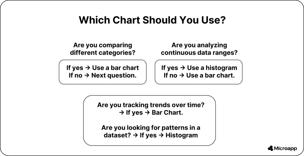
Bar charts are your go-to when you want to compare values across categories or track trends over time.
Best scenarios include:
- Market trends: Compare product sales month by month.
- Performance tracking: Visualize your team’s output by department.
- Qualitative insights: Show survey results like satisfaction levels or customer segments.
✨ Tip: Use color gradients or stacking to emphasize differences, ideal for presentations and dashboards.
👉 If you need inspiration, check out our guide on Attendance Tracker Apps for Teachers to see how simple data visualization can improve productivity.
When to Use a Histogram
Histograms are perfect for understanding data patterns and variability.
Use them when you need to:
- Analyze distributions: Understand how values spread out (e.g., student scores).
- Identify outliers: Detect extreme values like unusually high expenses.
- Perform statistical analysis to gain insights into the mean, median, and range.
💡 Example: A data analyst may use a histogram to see if customer ages follow a normal distribution for targeted marketing.
👉 For a quick start, explore our article What Are Histograms? to learn how they work in more detail.
Histograms vs Bar Charts: Advantages and Limitations
While both charts are helpful, they do have limitations.
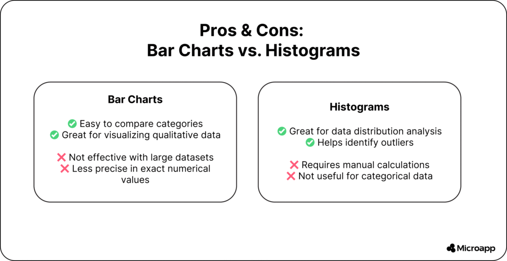
✅ Advantages of Bar Charts
- Easy to understand and compare.
- Flexible layout (stacked, grouped, or horizontal).
- Great for reports, dashboards, and presentations.
⚠️ Limitations of Bar Charts
- Becomes cluttered with too many categories.
- Lacks precision for exact values.
✅ Advantages of Histograms
- Helps identify patterns and outliers.
- Excellent for understanding data spread and variability.
- Useful for statistical or predictive analysis.
⚠️ Limitations of Histograms
- Requires continuous numeric data.
- Manual calculations can be time-consuming.
Summary: Histogram vs Bar Graph at a Glance
| Aspect | Histogram | Bar Graph |
|---|
| Purpose | Distribution analysis | Category comparison |
| Bars Touch? | Yes | No |
| Data Type | Quantitative | Categorical |
| Examples | Height, age, time | Sales, departments, cities |
Which One Should You Use?
Both histograms and bar charts are effective ways to visualize data—but the key is knowing when to use each.
- Use a bar chart when comparing categories or time-based data.
- Use a histogram when analyzing data distribution or spotting outliers.
By mastering both, you’ll not only make your data easier to understand but also communicate insights more clearly and confidently.
So, what are you waiting for? Try our Histogram Maker today and start visualizing your data like a pro.
FAQs
What is the main difference between a histogram and a bar chart?
A histogram shows how continuous data is distributed across ranges, while a bar chart compares discrete categories. In a histogram, bars touch each other; in a bar chart, they don’t.
Can you use a bar chart instead of a histogram?
Not ideally. A bar chart is for categorical data (like product categories), while a histogram is for continuous data (like temperature or age ranges).
When should I use a histogram over a bar graph?
Use a histogram when you want to analyze distribution patterns, detect outliers, or understand frequency within data intervals.
Are histograms and bar graphs used in statistics?
Yes, both are widely used in statistics—histograms for analyzing data spread and bar graphs for comparing categorical variables.