When building modern, responsive websites, one small decision can make a big difference: choosing between rem vs px in CSS.
The choice affects how your designs scale, the readability of your text, and the consistency of your layout across screens.
In this guide, we’ll break down the difference between CSS rem and px, show you when to use rem vs px, and share best practices to make your designs flexible, scalable, and accessible.
Whether you’re new to CSS or refining your front-end skills, you’ll learn to make smarter styling decisions.
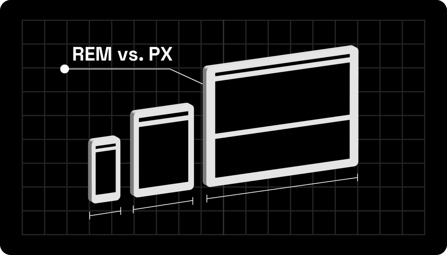
REM vs PX in CSS: Differences
What is REM in CSS?
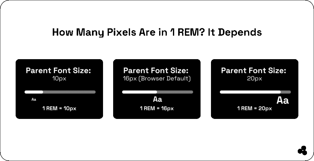
REM (Root EM) is a CSS unit that scales relative to the root element’s (html) font size — not the parent element like em.
For example, if your root font size is 16px, then:
1rem = 16px
2rem = 32px
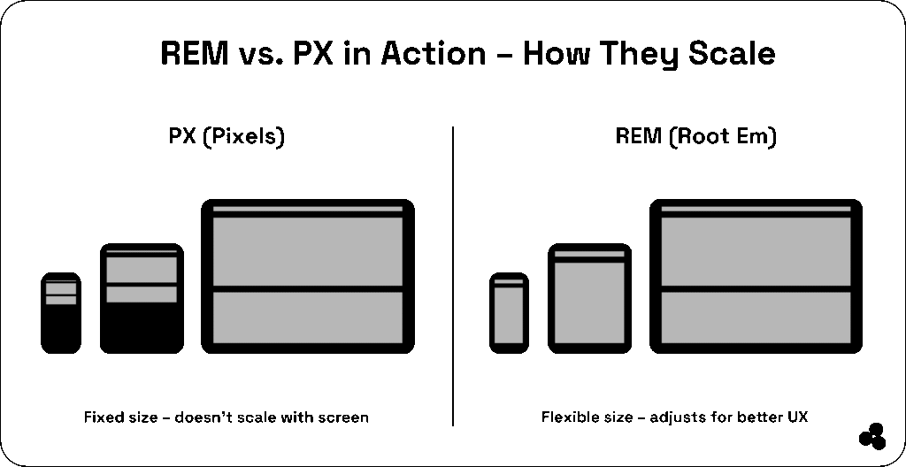
Using rem units helps keep your design responsive and consistent, especially when users change their browser’s default font size.
📝 What is rem in CSS? It’s a relative unit that scales based on the root font size, ensuring consistency and accessibility across devices.
What is PX in CSS?
PX (pixel) is a fixed unit that doesn’t scale with user preferences or screen sizes. While it’s excellent for pixel-perfect precision, px can cause issues with responsive design and accessibility — especially when users zoom in or use high-resolution displays.
Example:
font-size: 16px; /* stays the same no matter what */
📝What does px mean in CSS? It’s an absolute unit used to define elements with exact dimensions, best for small, static design elements.
rem vs px: Key Differences
| Feature | rem | px |
|---|---|---|
| Definition | Relative to root font size | Fixed size |
| Scalability | Scales automatically | Does not scale |
| Accessibility | User-friendly | Can ignore browser settings |
| Responsiveness | Great for responsive design | Limited flexibility |
| Best for | Typography, layouts | Borders, icons, static elements |
💬 What’s the difference between rem and px in CSS? EM adapts to the root font size (ideal for scaling), while px stays fixed (ideal for precision).
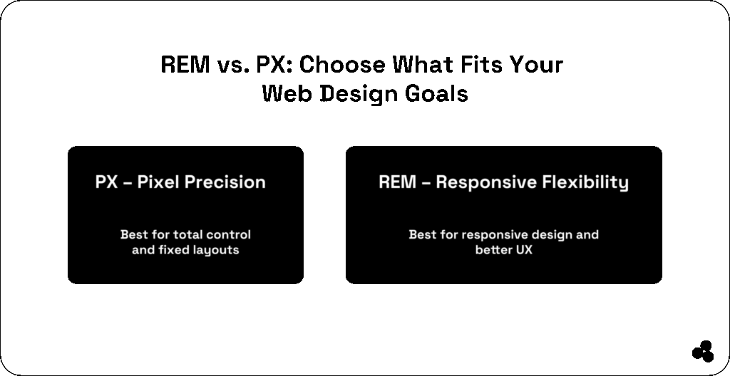
When to Use rem vs px in CSS
Understanding when to use rem vs px in CSS can help you create designs that are both precise and adaptable.
Use rem when:
- Designing responsive or accessible layouts
- Setting font sizes, margins, or paddings
- Building scalable interfaces that adapt to different viewports
Example:
h1 {
  font-size: 2rem;
}
Use px when:
- You need exact pixel control (like borders or icons)
- Working on static or small UI elements
Example:
.icon {
  width: 24px;
  height: 24px;
}
📝 Is rem responsive? Yes — rem units scale automatically based on the root font size, making them ideal for responsive web design.
Best Practices for rem and px in CSS
Follow these proven tips to strike the perfect balance between control and flexibility:
- Set a root font size (
html { font-size: 16px; }) so all rem units scale consistently. - Use rem for fonts, spacing, and layout, px for fixed-width assets.
- Mix carefully — too many px values can break scalability.
- Test responsiveness by adjusting your root size and observing the results.
💡 Tip: Try the REM to PX Converter to quickly find equivalent sizes and test scaling effects.
Practical Code Example
Here’s how you can combine rem and px for a balanced design:
html {
  font-size: 16px;
}

body {
  font-size: 1rem; /* 16px */
  margin: 2rem; /* 32px */
}

.button {
  padding: 0.75rem 1.5rem; /* Scales with root */
  border-radius: 4px; /* Fixed corners */
}
Related CSS Topics You’ll Love
Take your front-end skills even further with these guides and tools:
- CSS Animation Guide — Master keyframes, transitions, and timing functions.
- CSS Transform Properties — Learn how to scale, rotate, and skew elements smoothly.
- CSS Animation vs Transition — Understand the difference and when to use each.
- REM to PX Converter Tool — Perfect for quick calculations.
- The Complete Coding for Beginners (Udemy) — Level up your web fundamentals.
Think in rem, Fine-Tune with px
The debate between CSS rem and px isn’t about choosing one over the other; it’s about knowing when and how to use each effectively.
- Use rem to achieve a responsive, user-friendly design.
- Use px for small, precise UI details.
With the right balance, you’ll build websites that look amazing and perform beautifully across every screen size.