Have you ever stared at a long list of numbers — test scores, sales figures, or survey responses — and wondered, “How do I make sense of this?”
That’s where a histogram comes in. It’s a visual tool that transforms raw numbers into an easy-to-read format, enabling you to identify patterns, peaks, gaps, and outliers quickly.
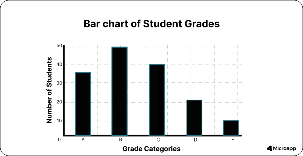
In fact, when you ask “what are histograms?”, you’re asking how to unlock the story hidden in your data. The problem is that many charts compare categories or single values.
But if you want to understand how a continuous set of values is distributed (for example, how many students scored within each range of test marks), a standard bar chart won’t cut it.
What you really need is a tool built for that scenario — and that tool is the histogram.
What are Histograms?
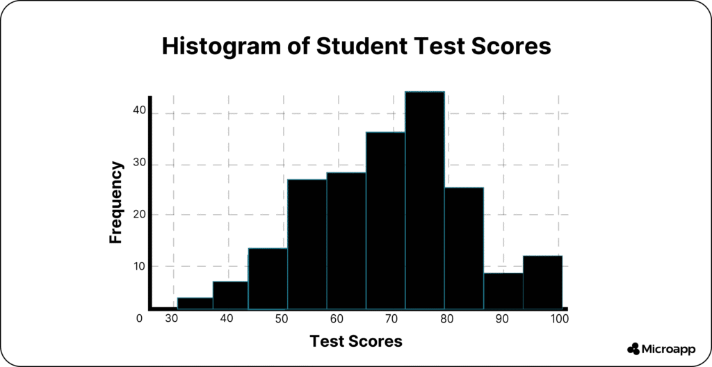
A histogram is a type of graph that displays the distribution of numerical data by dividing it into equal intervals, called bins. Each bar represents the number of values that fall within that range.
Unlike bar graphs, histograms have no gaps—because the data is continuous.
💬 FAQ: What does a histogram look like?
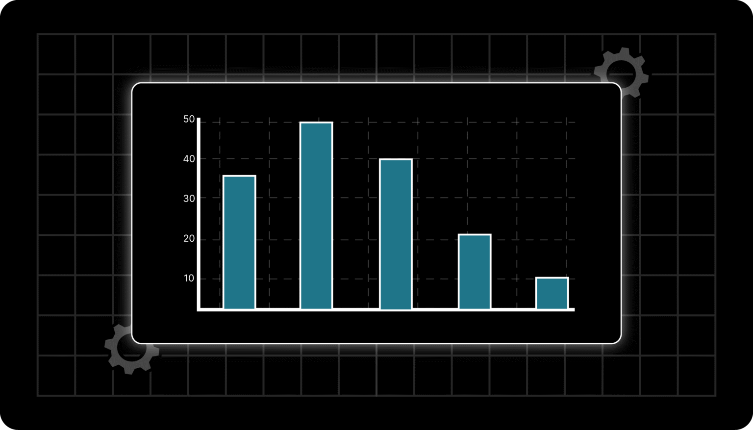
Imagine a bar chart where each bar touches the next. The X-axis shows number ranges (like 0–10, 11–20), and the Y-axis shows frequency (how many data points fall there).
Tip 💡: Think of a histogram as a snapshot of your data’s shape—where most values lie, where the extremes are, and whether it’s symmetrical or skewed.
What are The Features of a Histogram?
The main features are the bins, frequency counts, and overall shape. A histogram helps you understand distribution, detect outliers, and analyze patterns in continuous data.
- Bins (intervals): The ranges of values on the X-axis (e.g., 0–10, 10–20).
- Frequency: The height of each bar represents how many data points fall in that bin.
- Continuous bars: No gaps between bars—unlike bar graphs.
- Shape indicators, such as peaks, tails, or gaps, reveal trends in your data.
Histogram vs. Bar Graph
| Feature | Histogram | Bar Graph |
|---|
| Data type | Continuous numerical data | Categorical data |
| Gaps between bars | None (bars touch) | Yes (bars separated) |
| Purpose | Shows data distribution | Compares categories |
| Example | Test scores, ages | Fruits sold, brands |
💬 FAQ: What are histograms used for?
They’re used to visualize continuous numerical data, making it easy to see how data values are spread across ranges. Perfect for analyzing scores, times, weights, or measurements.
How to Create a Histogram (Step-by-Step)
Creating a histogram is easier than it looks. All you need is some continuous data — and a few wise choices when setting up your intervals (bins). Let’s walk through it step by step:
1️⃣ Collect Your Data
Start by gathering the dataset you want to visualize. This could be:
- Student test scores (0–100)
- Monthly sales totals
- Response times for an app or website
👉 Example: Suppose you have test scores from 100 students ranging from 25 to 95.
2️⃣ Choose Your Bins (or Intervals)
Bins are the ranges of values that group your data. Each bin represents a slice of your dataset.
- For example: 0–20, 21–40, 41–60, 61–80, 81–100.
- Each bin should be equal in width to maintain a balanced histogram.
💡 Tip: Too many bins make your histogram look noisy and random, while too few can hide key patterns.
💬 FAQ: How many bins should a histogram have?
There’s no strict rule, but a good starting point is √n (square root of your number of data points). For example, with 100 data points, start with 10 bins and adjust the number as needed.
3️⃣ Count the Frequencies
Next, count how many data points fall into each bin.
- If 15 students scored between 81–100, that bin’s frequency is 15.
- Repeat this for every bin to see where your data clusters.
You can do this easily with Excel, Google Sheets, Python (using matplotlib or pandas), or even online tools.
4️⃣ Draw the Bars
Now, it’s time to visualize it.
- On the X-axis, place your bins (the ranges).
- On the Y-axis, plot the frequencies (the counts).
- Draw bars for each bin—ensure they touch, as histograms display continuous data.
💡 Tip: If your bars don’t touch, that’s a bar chart — not a histogram.
5️⃣ Interpret the Shape
Once your histogram is ready, take a closer look at its shape:
- Symmetrical: Your data follows a normal (bell-shaped) curve.
- Right-Skewed: More data on the left, with a tail on the right.
- Bimodal: Two peaks — maybe your data has two main groups.
- Uniform: Even bar heights — your data is spread out evenly.
Recognizing these shapes helps you understand trends, detect outliers, and make better data-driven decisions. To make it easier, use our histogram maker.
Types of Histograms (and What They Tell You)
Each histogram shape tells a different story about your data. Here’s what the main types look like — and how to interpret them 👇
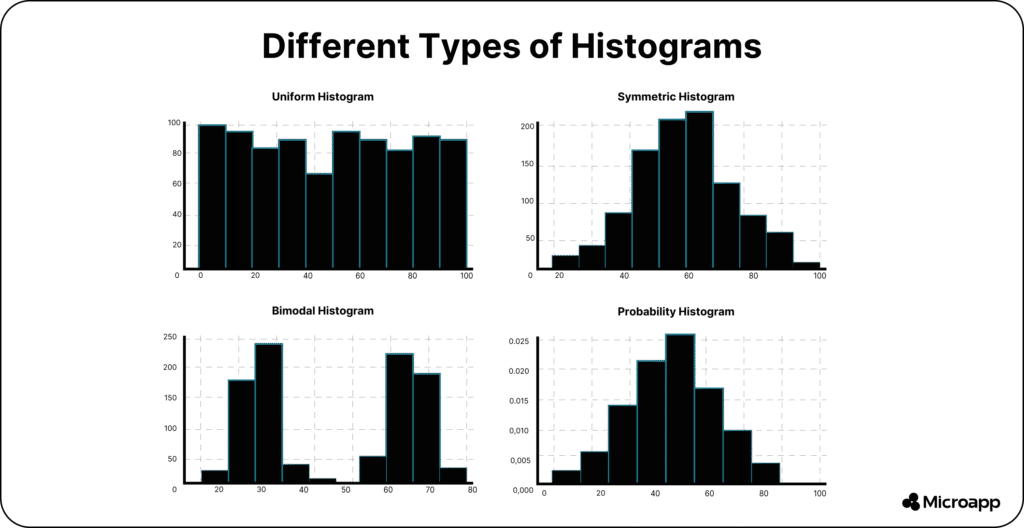
1️⃣ Uniform Distribution
Bars are roughly equal in height → values are evenly spread across the range.
Example: Rolling a fair six-sided die multiple times — each outcome (1–6) appears about the same number of times.
📊 What it tells you: There’s no clear trend or clustering; all values occur with similar frequency.
2️⃣ Symmetric / Normal Distribution
The classic bell curve shape indicates that the data is balanced around the center.
Example: Heights of adult humans — most people fall around the average, with fewer very short or very tall individuals.
📊 What it tells you: Your data follows a regular pattern, which is ideal for many statistical analyses.
3️⃣ Bimodal Distribution
Two distinct peaks indicate that the data has two dominant groups.
Example: Test scores from two different classes combined — one class scored high, the other scored lower.
📊 What it tells you: There may be two different populations or factors influencing your dataset.
4️⃣ Skewed Distribution
A long tail on one side → values are concentrated elsewhere.
- Right-skewed: Tail on the right (e.g., most people earn modest salaries, but a few earn very high ones).
- Left-skewed: Tail on the left (e.g., exam scores where most did well, but a few scored very low).
📊 What it tells you: Your data isn’t balanced — the average is pulled in the direction of the tail.
5️⃣ Truncated Distribution
The tails are cut off → data is filtered or limited by constraints.
Example: A manufacturer rejects any product outside specific weight limits, so only items within that range appear.
📊 What it tells you: You’re viewing only part of the dataset — the extremes have been removed intentionally.
6️⃣ Comb Distribution
Alternating tall and short bars → often caused by rounding errors or incorrect bin sizing.
Example: Recording temperatures rounded to the nearest 0.5°C, but using 0.1°C bins — some bins will appear empty or have much lower values.
📊 What it tells you: Your bin settings or data collection process may need adjustment for accuracy.
💬 FAQ: What are the different types of histogram distributions?
Common ones include uniform, normal (bell-shaped), bimodal, and skewed distributions. Each highlights a unique data pattern — helping you identify trends, groupings, or outliers in your dataset.
When Would You Use a Histogram?
Use a histogram when you want to:
- Understand data distribution (e.g., sales ranges, test scores).
- Identify outliers or clusters.
- Visualize performance trends over continuous ranges.
- Check statistical assumptions, such as normality, in your data.
Tip 🚀: If your dataset feels overwhelming, building a histogram is the fastest way to make sense of it.
💡 Also, check out how you can build a quiz generator in a weekend using our Microapp platform and start making money.
Real-World Histogram Examples
- Education: Visualize grade distributions to spot high or low performers.
- Business: Analyze purchase amounts to understand customer spending habits.
- Manufacturing: Detect process variations in product weights or sizes.
- Marketing: See how long users spend on your site or app.
💬 FAQ: What are histograms suitable for?
They’re ideal for understanding data behavior—finding trends, spotting anomalies, and guiding decisions with visual evidence.
Turn Data Into Insights — and Simplify Your Work with Microapp
Now that you understand what histograms are and how to use them, you can transform raw data into clear, visual insights that drive smarter decisions.
Histograms aren’t just for analysts — they’re for anyone who wants to quickly make sense of numbers, spot patterns at a glance, and present information with confidence.
Whether you’re tracking performance, visualizing sales, or comparing trends, a well-crafted histogram helps you see what really matters.
But here’s the best part — you don’t have to build everything from scratch.
At Microapp, you’ll find ready-to-use apps and tools designed to make work simpler, faster, and more efficient — from automating reports to visualizing data with just a few clicks.