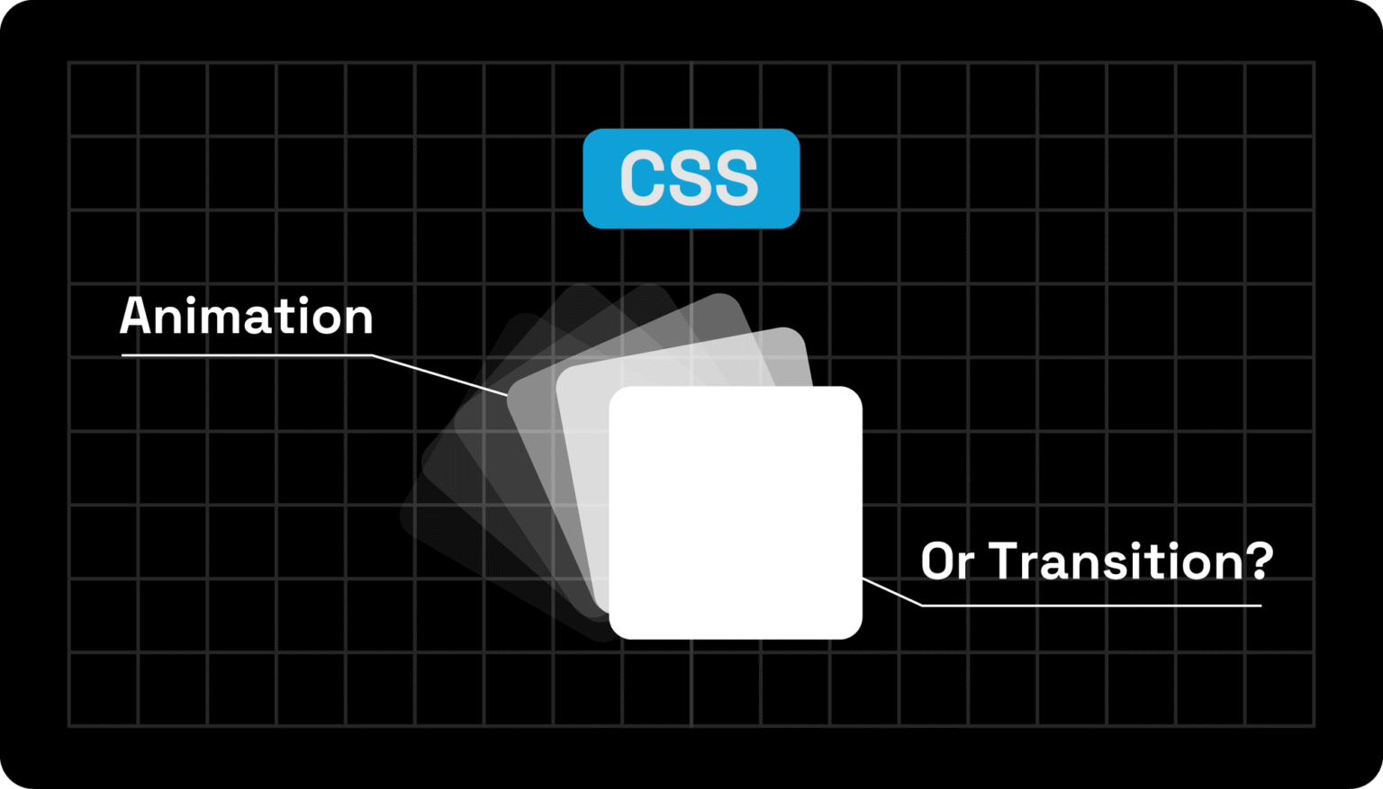
In web development, knowing when to use a CSS animation vs CSS Transition can make the difference between smooth, engaging interfaces and sluggish, confusing interactions.
Many developers struggle to understand which tool fits their needs, when to trigger effects, and how to maintain performance across devices.
In this guide, we’ll break down the key differences between CSS Animation vs CSS Transition, show you practical use cases, and provide tips to streamline your workflow.
By the end, you’ll confidently choose the right approach to create polished, dynamic web experiences that delight users.
CSS Animation vs CSS Transition: What is The Difference?
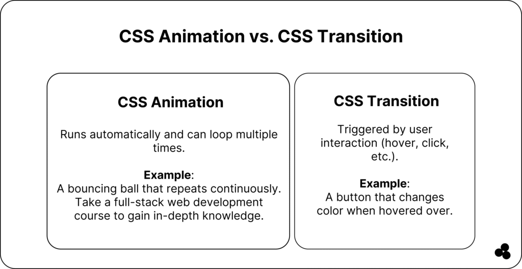
What Is a CSS Transition?
A CSS Transition smoothly changes a property value over time, triggered by a user interaction, such as hovering, focusing, or clicking.
Key points:
- Applied to state changes only
- Cannot loop automatically
- Ideal for simple, user-triggered effects
Example:
button { background-color: #3498db; transition: background-color 0.3s ease-in-out; } button:hover { background-color: #2ecc71; }

💡 Tip: Use transitions for hover effects, interactive buttons, and subtle UI feedback.
💬 Can transitions loop automatically? No, they only run when a property value changes. Use CSS Animation for continuous motion.
What Is a CSS Animation?
A CSS Animation allows you to animate properties over time with keyframes, loops, and delays.
Key points:
- Can run automatically or infinitely
- Supports multi-step sequences via
@keyframes - Offers timing functions, delays, and iteration counts
@keyframes bounce { 0% { transform: translateY(0); } 50% { transform: translateY(-20px); } 100% { transform: translateY(0); } } .ball { animation: bounce 2s infinite; }

💡 Tip: Use animations for complex sequences, looping effects, or attention-grabbing elements like loaders or alerts.
💬 Are CSS animations heavier than transitions? Animating layout properties can affect performance; stick to transform and opacity for smoother results.
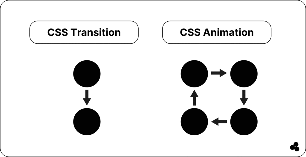
Here is another easy way to help you visualize the differences between CSS animation and transition
CSS Animation vs CSS Transition – Side-by-Side Comparison
| Feature | CSS Transition | CSS Animation |
|---|---|---|
| Trigger | State change (hover, click) | Automatic or looped |
| Control | Simple property changes | Multi-step via keyframes |
| Repetition | No | Yes (iteration count) |
| Timing | Duration + easing | Duration, easing, delay, iteration |
| Use Case | Buttons, hover effects | Loaders, banners, attention grabbers |
💡 Tip: Use transitions for simple, interactive UI feedback; use animations for dynamic, repeated effects.
When to Use CSS Transition vs CSS Animation (With Examples)
Choosing between a CSS Transition vs CSS Animation depends on what triggers the effect, how long it lasts, and how complex the motion is. Here’s how to decide 👇
When to Use CSS Transition
Use CSS Transitions when you need a simple, smooth effect that occurs after a user interaction (such as hover, click, or focus). Transitions are ideal for small, reversible changes in your UI — such as color shifts, size adjustments, or button states.
Perfect for:
- Hover effects on buttons or links
- Opening menus or dropdowns
- Changing opacity or color on focus
- Smoothly expanding or collapsing simple elements
Example: Button Hover Effect
button {
background-color: #3498db;
color: #fff;
padding: 10px 20px;
transition: background-color 0.3s ease, transform 0.3s ease;
}
button: hover {
background-color: #2ecc71;
transform: scale(1.05);
}
Here, the background color and scale change smoothly only when the user hovers over the element. No loop or keyframes needed — just instant, simple interaction.
💡 Tip: Use CSS transitions when the user initiates the change. For example, when a mouse hovers, a form field gains focus, or a toggle is switched.
💬 Can I use transitions for continuous animations? No, transitions only run when a property changes as a result of user interaction. For ongoing or looping effects, use CSS animations instead.
When to Use CSS Animation
Choose CSS Animations when you need more control, such as looping effects, sequential steps, or motion that starts automatically. Animations use @keyframes to define multiple stages of change, and can run indefinitely or on page load.
Perfect for:
- Attention-grabbing effects (bouncing icons, loaders)
- Animated backgrounds or banners
- Sequential transitions (e.g., fade → slide → scale)
- On-load visual cues or decorative loops
Example: Bouncing Loader
@keyframes bounce {
0%, 100% { transform: translateY(0); }
50% { transform: translateY(-20px); }
}
.loader {
display: inline-block;
width: 20px;
height: 20px;
background: #f39c12;
border-radius: 50%;
animation: bounce 1s infinite;
}
This animation starts automatically, loops continuously, and doesn’t require any user input — a feature that transitions cannot achieve.
💡 Tip: Use CSS animations for dynamic storytelling — banners, notifications, or when you want the interface to feel alive even before the user interacts.
💬 Can I trigger animations on hover, too? Yes. You can start an animation on hover by applying the animation property inside the :hover selector.
Quick Rule of Thumb
| Use Case | CSS Transition | CSS Animation |
|---|---|---|
| Hover or focus interactions | ✅ | |
| Looping effects (loaders, attention-grabbers) | ✅ | |
| Auto-start motion on page load | ✅ | |
| Subtle UI feedback | ✅ | |
| Complex, multi-step motion | ✅ |
💡 Tip: For the best performance, animate only transform and opacity. Avoid animating width, height, or margin, which cause layout reflows and can hurt performance.
💬 Where can I learn more about CSS animations? Courses like Udemy provide structured learning paths for CSS transitions and animations.
Example in Context
Let’s say you’re designing a CTA button on a landing page.
- Use a CSS Transition to make it gently scale up when hovered — this gives the user instant feedback.
- Add a CSS Animation on the same page to make an arrow icon beside the button pulse continuously, drawing the eye without interaction.
This combination of both effects creates an engaging and balanced user experience. Learn more about hardware-accelerated transforms in our CSS Transform Properties Guide.
Performance & Accessibility Considerations
- Hardware acceleration: Use
transformopacityfor smooth rendering. - Reduced motion: Respect
prefers-reduced-motionto avoid motion sensitivity issues. - Minimize layout changes: Avoid animating.
width,height, ormarginwhich trigger reflows. - Accessibility: Ensure animations are not distracting or overwhelming for users.
💬 Can CSS transitions or animations affect performance? Yes. Animating layout-heavy properties or too many elements can slow down your page. Stick to best practices for efficiency.
Quick Code Examples
Transition Example (hover effect):
.card {
  transition: transform 0.3s ease;
}
.card:hover {
  transform: scale(1.05);
}
Animation Example (looping bounce):
@keyframes shake {
  0%, 100% { transform: translateX(0); }
  25% { transform: translateX(-5px); }
  75% { transform: translateX(5px); }
}
.icon {
  animation: shake 0.5s infinite;
}
💡 Pro Tip: Use our CSS Animation Generator to create animations visually, and try the CSS Transform Generator to experiment with advanced transform effects.
Common Mistakes & How to Avoid Them
- Animating layout properties (width, height, top, left) → use
transforminstead. - Animating too many elements simultaneously → stagger or limit animations.
- Ignoring user preferences → respect.
prefers-reduced-motion. - Mixing transitions and animations improperly → know which tool fits the task.
💬 Should I use rem or px for animated elements? Check our guide on rem vs px in CSS — rem ensures better scalability across devices.
Mastering CSS Animation vs CSS Transition
By now, you’ve seen that CSS Animation vs CSS Transition isn’t about which one is better — it’s about using the right one for the right purpose.
- Use transitions for simple, interactive effects that respond to user input.
- Use animations when you need looping, staged, or automatic motion.
When combined, these tools help you craft interfaces that feel fluid, modern, and intuitive.
Whether you’re building a subtle hover state or a lively hero animation, mastering both gives you the creative edge to make your websites truly stand out.
✨ Your next step: Experiment with both in your next project. Start small by animating a button or icon, then scale up to more complex interactions.
The more you practice, the more naturally you’ll know when to use one over the other.