Ever wondered how to make your website elements move, spin, or scale beautifully without using JavaScript? With CSS transform properties, you can bring motion and depth to your designs using simple syntax.
From 2D transformations like rotate and skew to 3D transformations that add perspective, mastering this CSS property can completely change how users experience your site.
In this guide, we’ll break down how to use transform properties effectively, when to combine them with CSS animations or transitions, and share tools like the free CSS Transform Generator to help you experiment and create amazing effects in minutes.
What is the CSS Transform Property?
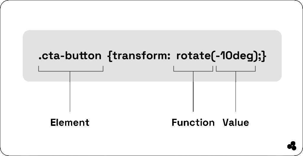
The CSS transform property allows you to visually manipulate elements — scaling, rotating, translating, or skewing them — without disturbing the document flow.
For example:
div {
transform: rotate(45deg);
}
This simple line rotates your element 45 degrees.
You can combine multiple transformations, like:
transform: translate(20px, 30px) rotate(15deg) scale(1.2);
Here is how a straightforward CSS transform looks:
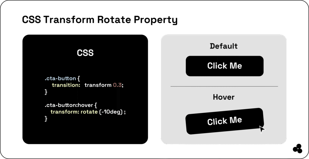
💡 Tip: Combining transforms lets you build interactive effects such as buttons that “pop” when hovered or images that tilt in 3D.
📝 What does the CSS transform property do? It lets you rotate, scale, translate, or skew an element — making your design more dynamic and interactive.
👉 Discover how to image compress your pictures for improved online speed.
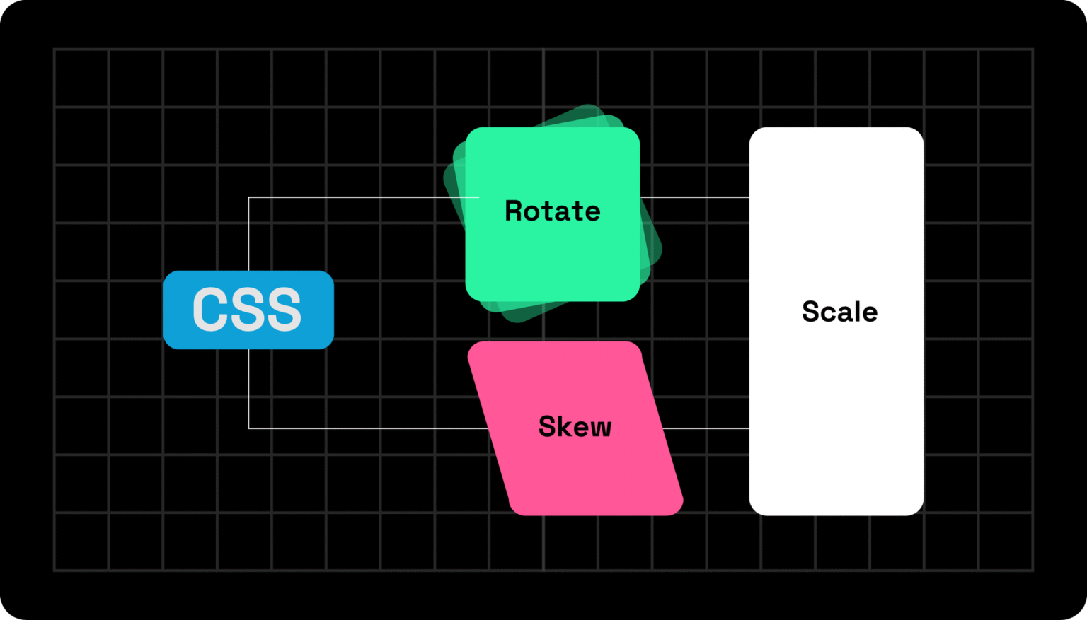
Familiar CSS Transform Properties (With Examples)
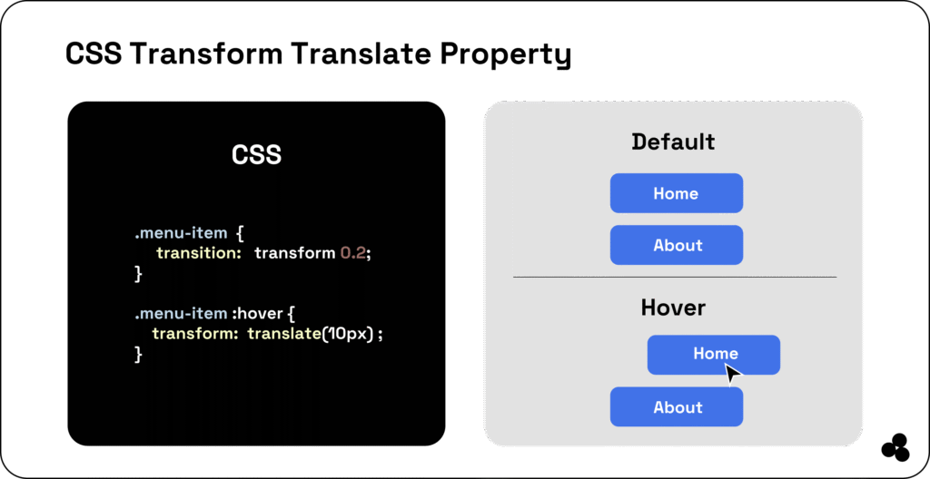
a. Translate()
Moves an element along the X and Y axis.
transform: translate(50px, 100px);
Use this when you need subtle movement, like sliding cards or buttons into view.
b. Rotate()
Spins the element clockwise or counterclockwise.
transform: rotate(180deg);
This works for icons or loaders.
c. Scale()
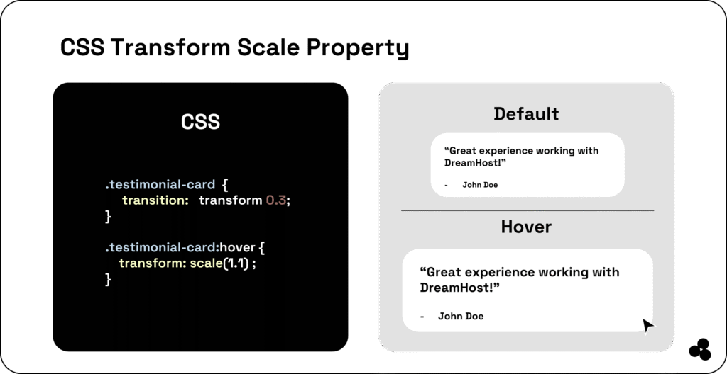
Increases or decreases the element’s size.
transform: scale(1.5);
Perfect for hover effects that feel dynamic and engaging.
📝 What’s a practical example of scaling in CSS? Hover zoom effects on images or buttons — and combining them with SVGs makes your UI lighter. See why in Benefits of Using SVG.
d. Skew()
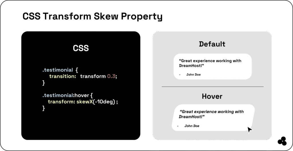
Tilts elements along X and Y axes.
transform: skew(15deg, 10deg);
e. Matrix()
Applies multiple transforms at once (advanced).
💡 Learn more about how to create smooth animations with these properties in our guide: CSS Animation Explained.
📝 What are some real-world uses of CSS transform? Hover effects, sliders, rotating icons, and 3D card flips are typical examples of CSS transforms in action.
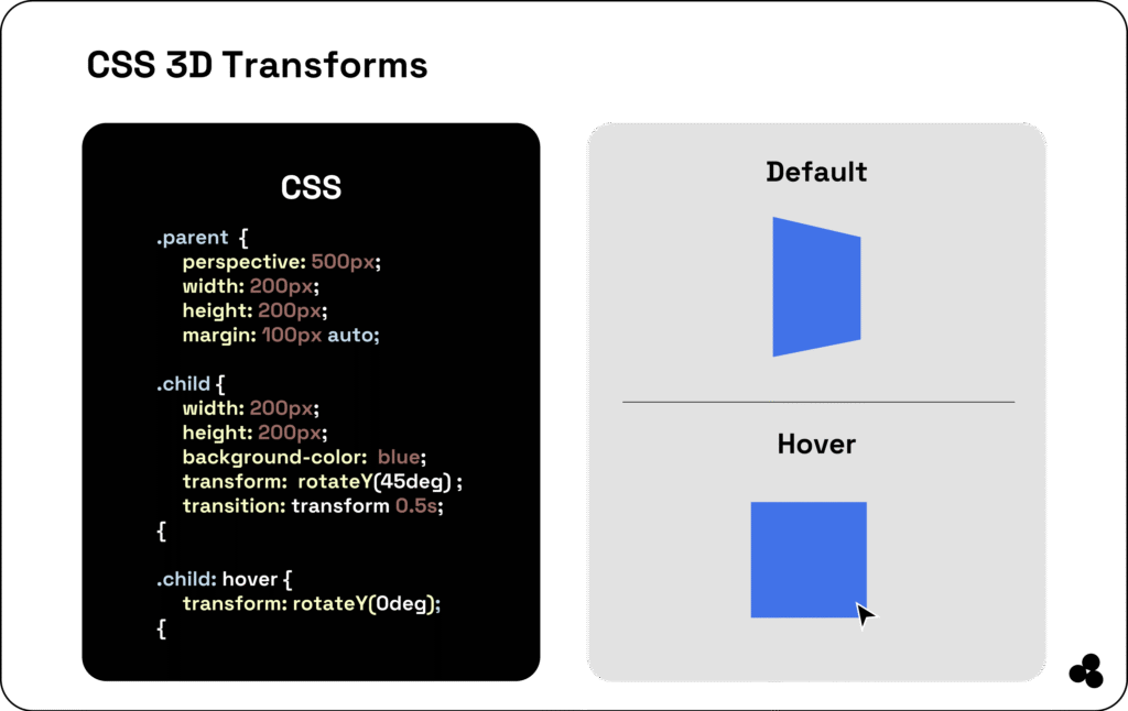
2D vs. 3D Transformations
While 2D transforms modify an element’s position on the X and Y axes, 3D transforms add depth along the Z-axis — ideal for creating immersive effects.
2D Example:
transform: rotate(45deg);
3D Example:
transform: rotateY(180deg);
📝 What’s the difference between 2D and 3D transforms in CSS? 2D affects only flat movement, while 3D creates depth and perspective.
You can add realism using:
transform: perspective(600px) rotateX(45deg);Explore this concept further using our CSS Transform Generator to visualize changes in real-time.
CSS Transform vs CSS Transition vs CSS Animation
It’s easy to confuse these, so here’s a simple way to remember:
| Feature | Transform | Transition | Animation |
|---|---|---|---|
| What it does | Changes shape/position | Smoothly changes between states | Loops or creates complex movement |
| Trigger | Manual or hover | User interaction | Auto or keyframes |
| Example | rotate(45deg) | transition: all 0.3s; | @keyframes spin {} |
📝 Can I use transitions with transform? Absolutely. Transitions make your transform effects smooth and natural.
👉 Learn more in CSS Animation vs CSS Transition.
When to Use CSS Transition vs CSS Animation (With Examples)
Knowing when to use each CSS transform property is key to smoother interfaces:
- Use Transform + Transition for small effects, such as hover zooms or button feedback.
- Use Animation + Transform for repeating or storytelling motion.
Example (Transition):
button:hover {
  transform: scale(1.1);
  transition: transform 0.3s ease;
}
Example (Animation):
@keyframes spin {
  0% { transform: rotate(0deg); }
  100% { transform: rotate(360deg); }
}
📝 What’s the best way to combine transitions and transforms? Add a transition property for smooth entry and exit effects — this avoids abrupt changes.
Advanced Transform Functions
Here’s where things get exciting:
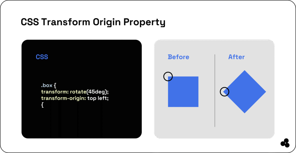
a. transform-origin
Defines the pivot point for transformations:
transform-origin: center;
b. transform-style
Controls how nested elements behave in 3D:
transform-style: preserve-3d;
c. perspective
Adds realistic depth:
perspective: 800px;
📝 How does perspective work in CSS transforms? It determines how far the viewer is from the aspect — higher values flatten the 3D effect.
Take a deeper dive with Udemy’s Web Animations Course.
Common CSS Transform Mistakes to Avoid
Even seasoned developers get tripped up here:
- Forgetting browser prefixes like
-moz-transform. - Missing
transform-origin, leading to strange rotations. - Using transform without transitions causes choppy animations.
📝 Why isn’t my transform working in CSS? Please verify that your transform property syntax is correct and ensure that no conflicting CSS rules override it.
To avoid layout pitfalls, read Tailwind Best Practices to Avoid.
Real-World Examples & Best Practices
Here’s how we use transforms effectively:
- Navigation:
translate()for slide-in menus. - Image Zooms:
scale()on hover for product previews. - 3D Cards:
rotateY()for flip animations.
📝 What does transform-origin control? It defines the point around which your transformation occurs — essential for rotations and scaling effects.
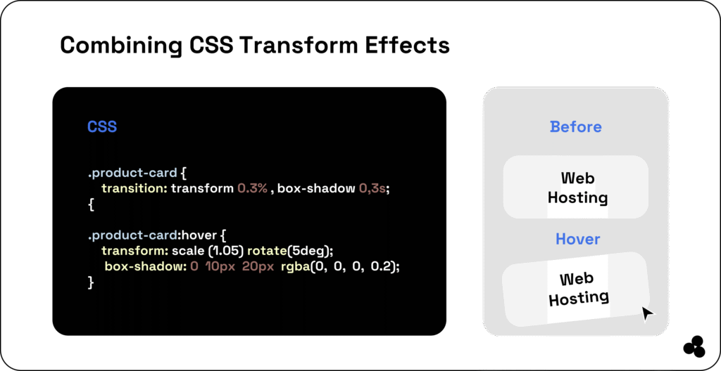
Combine Transforms With Other CSS Properties
You can blend transform with opacity, box-shadow, or even variables for impressive UI effects:
.card:hover {
  transform: scale(1.05) rotate(5deg);
  box-shadow: 0 5px 15px rgba(0,0,0,0.2);
}
📝 Can I animate multiple properties together? Yes — combine transform, opacity, and shadow for rich, smooth effects.
Compare REM vs. PX in CSS for scalable design units.
Transform Your Web Designs Like a Pro
Mastering CSS transform properties enables you to design visually engaging, modern web experiences — without requiring JavaScript.
Experiment, rotate, and scale your creativity using the CSS Transform Generator, and bring your designs to life.
You can even combine transforms with SVG graphics or HTML data tables to create beautiful, dynamic, and lightweight interfaces.
Keep exploring small CSS motion tricks — they add depth, speed, and polish that users love.